a distinctive, concretti-inspired color palette
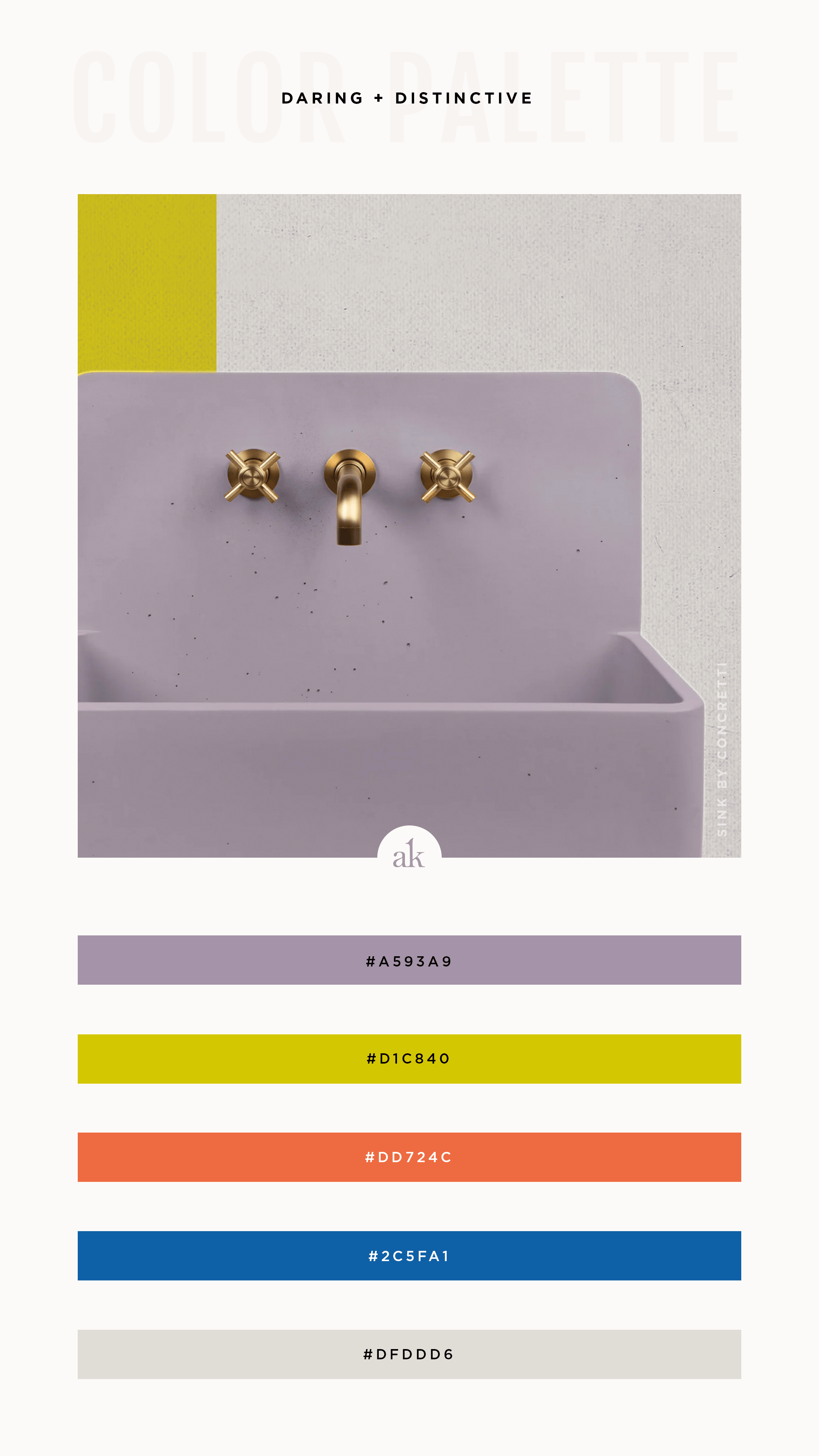
I’m circling back with a brighter, more unexpected variation of last week’s Concretti-inspired color palette. (Can’t explain it, but I really wanted to include this lavender inspired by my new favorite sink.) I hope you enjoy this distinctive, action-packed palette of chartreuse, tangerine, royal blue, cement gray, and—you guessed it!—lavender.
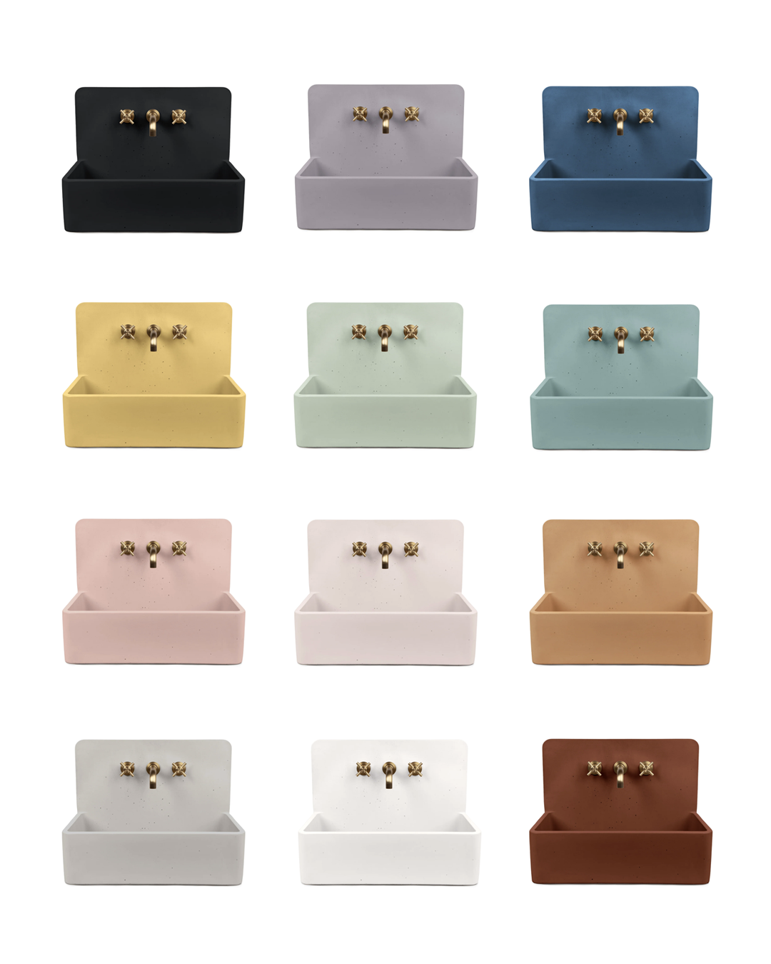
P.S. Now I want a sink in every room.
Click the button below to download a free printable PDF of this color palette that includes values for print (CMYK) and web (HEX, RGB, HSL) - as well as the closest Pantone matches for coated and uncoated stock! It’s everything you need to recreate this color combo on your own.
Happy Friday!